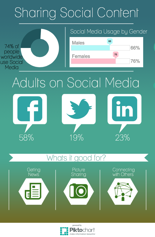
This week in CAP 105 I learned how to make infographics. Before today I never knew making one could be so easy, and FREE! I decided to make my infographic on the social media outlet of sharing data. To make my infographic I used a template from Piktochart and pulled my information from two online sources (1,2). I then customized the images to match my topic and changed the graph styles to better represent my topic. Learn how to use Piktochart and check out my Piktochart below!
7 Comments
Alexis Judge
3/25/2015 06:07:34 am
I love the simplicity of your infographic. Nice work!
Reply
3/25/2015 06:47:38 am
Your infographic is a good example of how to display boring information into something so easy to read! Great job!
Reply
Ben
3/26/2015 04:28:50 am
This is a phenomenal infographic. Great content and color scheme. Looks professionally done.
Reply
Chelsie
3/26/2015 06:33:31 am
I was nervous to make an infographic, only because they look complicated and really detailed. I was happy to learn that Piktochart made it so easy!
Reply
Heather Norment
3/26/2015 09:28:21 am
Love everything about this post. Great color scheme on your piktochart. I also really love the video.
Reply
Melissa Thomas
3/26/2015 02:49:43 pm
I love Piktograph too! I had fun with mine as well, you should check it out!! Yours looks awesome good job :)
Reply
Jamie DeMaagd
3/27/2015 02:17:47 am
I love the piktochart! Everything was big and easy to read!
Reply
Leave a Reply. |
AuthorAs a first year college student you can say my life is a little insane. My daily week consists of work, sorority events, club meetings and a whole bunch of college classes. Sometimes I get a little stressed but I wouldnt trade this life for anything! Archives
April 2015
Categories
All
|
Blogging for CAP 105
This section of my blog will be school orientated and based around my current class: Technology in Advertising and Public Relations.